Have you been asked to submit a graphical abstract for your research paper? If you’re unsure how to approach creating your own, this post provides an overview.
WHAT IS A GRAPHICAL ABSTRACT?
Graphical abstracts (also called visual abstracts) are an emerging type of research infographic that visually represent the main ideas from a paper or study. Abstracts are used in academic publishing to give the reader a concise overview of the key details of a research paper. Like a traditional text-based abstract, the graphical abstract creates a summary of the research information for the reader. They are similar to the posters presenters use at conferences to explain their work, but usually rely more on graphics than text to convey complex information. This helps the reader quickly decide whether they want to read the full paper.
INFOGRAPHICS, RESEARCH POSTERS, AND GRAPHICAL ABSTRACTS
Infographics, research posters, and graphical abstracts are related terms that describe information representations that use a combination of visual, textual, and numeric content to communicate a topic to an audience. While these terms are related, there are distinctions between each type and thus the terms are not interchangeable.
Infographic: A visualized hierarchy of infographics, research posters, and graphical abstracts (Brown 2024).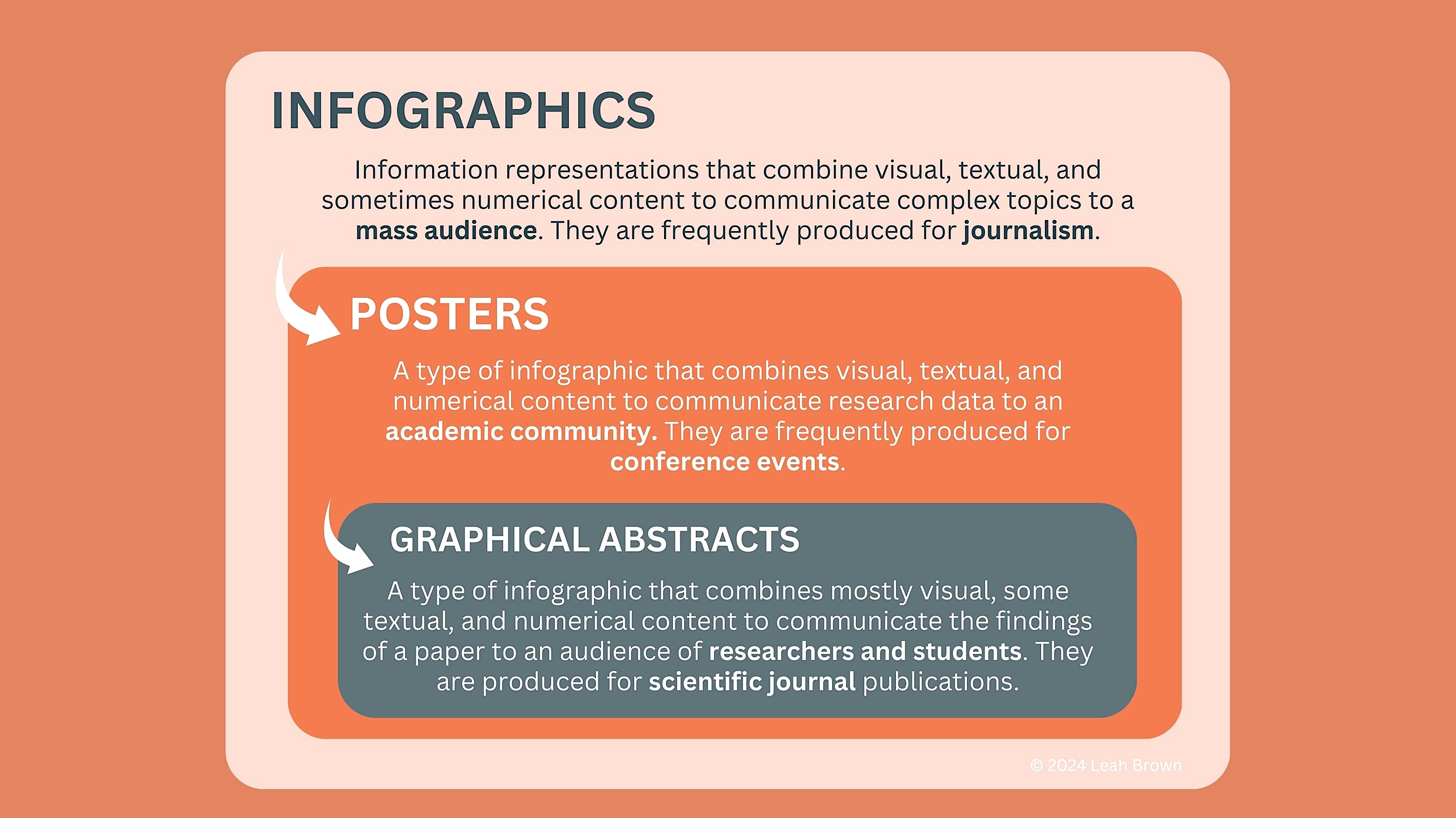
The term infographic is the broadest term of the three, and refers to a media type that uses visuals and text to translate data to a mass audience. Infographics are commonly used in journalism to explain complex topics to non-experts. The purpose of an infographic is to educate or entertain the reader. Infographics can be physical, digital, or some variety of mixed media.
A research poster is a type of infographic that also uses visuals and text to communicate, but the intended audience for this type of graphic may have some degree of previous knowledge about the topic. Posters are typically created for a single event, like a symposium or conference. A research poster can include detailed quantitative data visualizations, if the poster is reporting on the findings of a research study. The purpose of the poster is to communicate research within a research community, e.g., scientists working in subdomains of medicine, biology, chemistry, or physics. Research posters can be physical, digital, or both.
A graphical abstract is both a type of infographic and a research poster that uses visuals and text to summarize the purpose, methods, and data findings from a paper. Unlike a poster, however, a graphical abstract uses less text and more visual content. The purpose of the abstract is to summarize the paper enough so that the reader can decide if they want to dive in to the full paper for the finer details. Graphical abstracts are usually in digital format.
ADVANTAGES AND DRAWBACKS TO VISUAL CONTENT
Whether you’re using a text or a visual abstract, each must perform the same core function: they communicate the meaning of your research to an intended audience. Visualizations are not necessarily better than texts, and variation in reader learning styles will affect preferences for certain formats of information. Generally speaking, however, visual information is easier to synthesize for many people. This becomes important when there is a large collection of documents for a reader to evaluate as relevant or interesting.
SOME CONSIDERATIONS FOR GRAPHICAL ABSTRACTS
ADVANTAGES
Graphics help reduce the reader’s cognitive load. Many people find visual information easier and faster to make sense of.
They are easy to disseminate. Visuals can communicate across differences of language or levels of expertise more readily than text alone.
They can help increase research impact. Graphical abstracts can help increase the number of engagements of a paper.
They help you understand your own work. Visualizing research forces you to think deeply on the “aboutness” of your paper. This happens through the process of mapping novel or complex concepts to an image and narrative that the reader can make sense of.
DRAWBACKS
Graphical abstracts privilege visual thinking. While graphics appeal to many readers, they may not be as accessible for people who have issues with visual thinking.
They can be costly to produce. Specialized and expensive software tools may be needed depending on the type of graphic you are trying to create.
They require a time investment in terms of training and practice to do well. Translating your work visually requires carefully constructing and structuring the appropriate visual and textual content of the abstract.
A poorly constructed abstract can negatively affect your research impact. A graphical abstract that does not make sense to the reader may be discarded as irrelevant.
SHOULD YOU LEARN TO DESIGN A GRAPHICAL ABSTRACT?
If you’re a student or early career researcher, it pays to develop some proficiency in creating your own visual materials to communicate your research. A couple of reasons for this:
1) no one is more of an authority on what you mean than you are, so ideally you should be the person thinking about the best way to visualize your work;
2) paying someone else to do your graphic work can be expensive!
Perhaps coincidentally, graphical abstracts have become more common with the growth in Open Access (OA) publishing through journals and repositories. Open publishing evolved with the relatively recent turn to Open Science, a philosophy of practice that seeks to dissolve barriers to scientific collaboration. Open Access has created an opportunity for researchers to reach a broad audience since anyone can access an article published through an OA journal. It therefore becomes necessary to make your research understandable to many readers.
A FEW TIPS FOR APPROACHING GRAPHICAL ABSTRACT DESIGN
Currently, graphical abstract design has no formal rulebook, although there are robust guides developed by a variety of journal publishers and science graphic designers. If you are required to submit a graphical abstract with your paper, you must consult the publication’s style guide to make sure your abstract meets the requirements of the journal. A list of resources is presented at the end of this post.
A workflow for producing an abstract can be broken down most simply into 4 main parts:
1) User research: the stage where you identify your audience assumptions. As mentioned, creating your own visuals requires that you understand the key facets of your work. What does your audience need to know about your work in order to understand it? How much background or scope is required to give them an accurate picture of what you did in your paper?
2) Information visualization: the stage where you define what must be included in your abstract and identify the visual metaphors that best represent the ideas of your work. Here you are performing the first level of knowledge translation for your audience: reducing the complexity of your paper’s details via visualization.
3) Narrative layout: the stage where you identify how you will storyboard these metaphors into a cohesive graphic that allows the intended reader to make sense of your research process. This is where you are performing the second level of knowledge translation for the reader, by assembling your visuals and text into a layout that clearly tells the story of what you did in your paper.
4) Editing and visual design: the stage where you revise and refine the graphic for clarity, conciseness, accessibility, and style. You should give yourself enough time to work meticulously on the final result as even a gorgeous, well-planned abstract can be ruined by errors in editing. Worse, errors can confuse or mislead the reader.
A CHECKLIST OF QUESTIONS FOR GRAPHICAL ABSTRACT DESIGN
1) [User research] Identify your audience assumptions.
☑️ Is your graphic for a general audience of non-experts or a specific community of readers with some previous knowledge of your topic?
☑️ How accessible is your textual content? Are you using specialist vocabulary in your research that needs explanation? When possible, consider omitting jargon or including a brief glossary of technical terms.
☑️ What do you know about the numeracy (the ability to understand numeric data) of your audience? Think about how your numerical graphics will make the patterns and takeaways from your study obvious to your intended readers.
2) [Information visualization] Identify the visual metaphors that best represent the concepts of your work.
☑️ Have you identified the appropriate visual representations for your research? Are you explaining a population study? A process? A network? Your graphic choices should clearly translate the fundamental ideas of your research.
☑️ Will the complexity of your visuals make sense to your reader? It is more important for your visual data to be easily understandable than it is for it to be complicated but stylish.
☑️ How many images will it take to represent your study? There is limited space on a research poster, even less so on a graphical abstract. Avoid cluttering your graphic by selecting the minimum number of images it takes to accurately reflect the content of your paper.
3) [Narrative layout/storyboarding] Identify how you will storyboard these metaphors into a cohesive graphic.
☑️ How should your paper be explained to your audience? Medical abstracts follow a certain format for certain types of studies. Is the research process itself a key part of your paper? You might consider using a journey map to illustrate this. Are the findings of the study what you want your reader to take away from your abstract? Your graphic should be organized in a way that centers the data you consider the most important.
☑️ How much explanatory text do your visual components need for the reader to be able to make sense of them? Consider how much writing you are including when designing your abstract’s layout.
☑️ If applicable, does your layout conform to the style guide of the journal publisher?
4) [Editing and visual design] Revise and refine the graphic for clarity, conciseness, accessibility, and style.
☑️ Have you tested your visuals? Your advisors, professors, teaching assistants, and your student colleagues can give you critical feedback before you commit to a design.
☑️ Have you edited your written content to avoid wordiness and jargon?
☑️ Have you checked your final graphic’s visual style and accessibility? Review your font sizes and weights, colour and contrast, text and graphic alignments, and use alt-text for your images when possible.
Understandably, you may find it challenging to create graphics for your papers at first. You can get better by sketching out your ideas, and through continuously cultivating your literacy for abstract design. The most accessible way to do this is by studying examples in portfolios and repositories of graphical abstracts.
EXAMPLES
Graphical abstract: An Ecological Model of Transliteracy (Brown 2023)![]()
In this example from information science, I created a graphical abstract to illustrate the nested aspects of my model. Without a visual metaphor to guide the reader to the main idea, the premise of the model would be challenging to translate to a non-expert. As an infographic, this could work as a research poster, but it is slightly too text-heavy in the current version for a visual abstract and needs revision.
Graphical abstract: Polypharmacy in Older Adults After Transcatheter or Surgical Aortic Valve Replacement (Brown 2022)
For this medical abstract, I needed to contextualize the purpose and findings of the current study by situating it in the data collected in the original participant sample. In medicine, the storyboarding layout for explaining data typically follows a rigid format: you present the population details, the study design, and the key findings. I used a triptych layout here as it is easy to follow when framed as a three-act story with an introduction, a body, and a conclusion. The arrows between the acts are intended to subtly guide the reader along to the conclusion. However, they are likely unnecessary as many readers expect to read a graphic from left to right. Like the first example, this graphic could also work as a research poster. Another session of copyediting could refine the wordiness of the text content to improve it.
Thanks for reading! This blog is currently under construction and will be posting more topics like this on a regular basis in the coming weeks. Please bookmark this page if you’d like to follow future posts!
RESOURCES FOR CREATING GRAPHICAL ABSTRACTS
Guides and Examples
BioRender’s helpful design tips for graphical abstracts
Mind the Graph’s excellent guide to creating effective graphical abstracts
A sample of scientific graphical abstracts curated by sciencegraphicdesign.com
The Journal of Medical Internet Research has another curated sample of visual abstracts
Annals of Family Medicine’s guide to visual abstracts
Elsevier’s resource page on graphical abstracts
Software Tools
Slide Presentation Tools
Pay to Use: Standard programs like MS Powerpoint and Apple Keynote. Your computer likely has some version of a presentation builder already installed and they can be delightfully powerful tools for building science graphics.
Open Source Tools: Apache OpenOffice is a free software suite that works like Microsoft Office.
Graphic Design Tools
Pay to Use: Apps like Adobe Illustrator can be used to create re-usable vector graphics that can be scaled to different document sizes. Adobe Photoshop can be used for image editing. Each app is available with a subscription to Adobe Creative Cloud.
Open Source Tools: If you need an alternative to Adobe Creative Cloud, GIMP and Inkscape are just as powerful, have great communities of support, and are free to use.
Multimedia Design Tools: Canva offers a free tier and can be used to build a variety of media types for science content, including graphical abstracts and research posters. draw.io is a diagram and flowchart maker that works in-browser.

Leave a comment